I built it beautifully Package
Crafting aPremium Print Legacy.
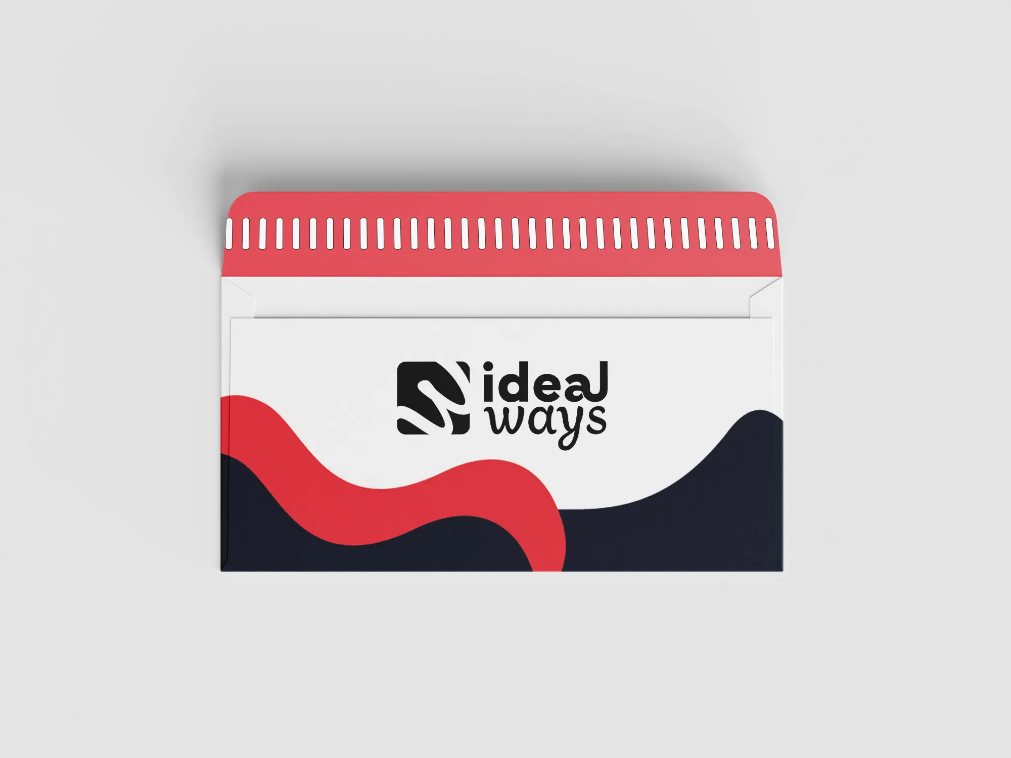
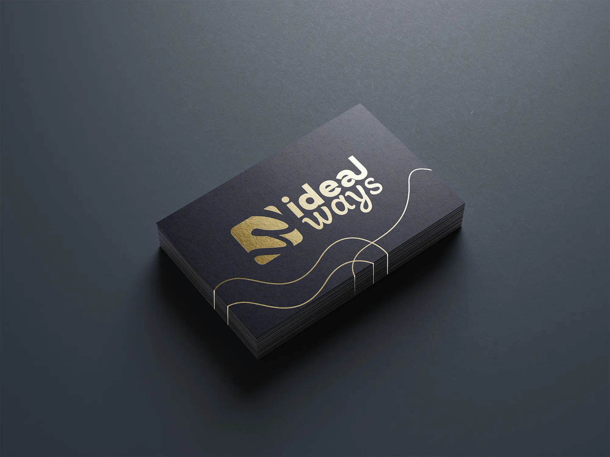
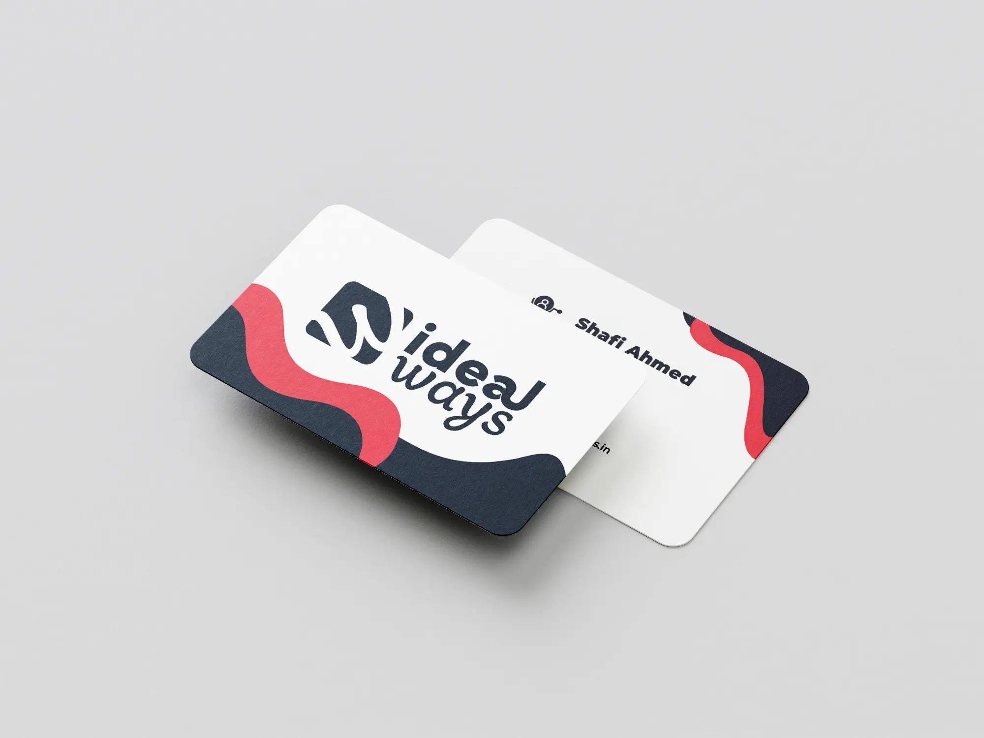
Ideal Ways is a specialized printing company focused on high-quality textures, premium papers, and unique materials like brushed metals. With such meticulous attention to detail in their physical products, their brand identity needed to reflect that same tactile craftsmanship and modern premium feel.
My role was to conceptualize and execute a complete 360-degree brand overhaul. From designing a clever logo that plays with negative space, translating it into stunning textured print collateral, and finally bringing it to life in a high-conversion digital experience.
The Building Blocks
The logo uses clever negative space to symbolize a looped, flowing paper roll feeding through a press, creating an abstract ‘S’ within the solid dark container.
The typography was customized with interconnected letterforms to represent the seamless, continuous nature of their printing process. The heavy container visually grounds the mark, mimicking the physical weight of the specialty metals and thick cardstocks they print on.
ColorPsychology
#FF4949
Passionate
Red
#0B1E2D
Foundation
Slate
#FF4949
Electric
Blue
TypographySystem
Montserrat Black
Montserrat Normal
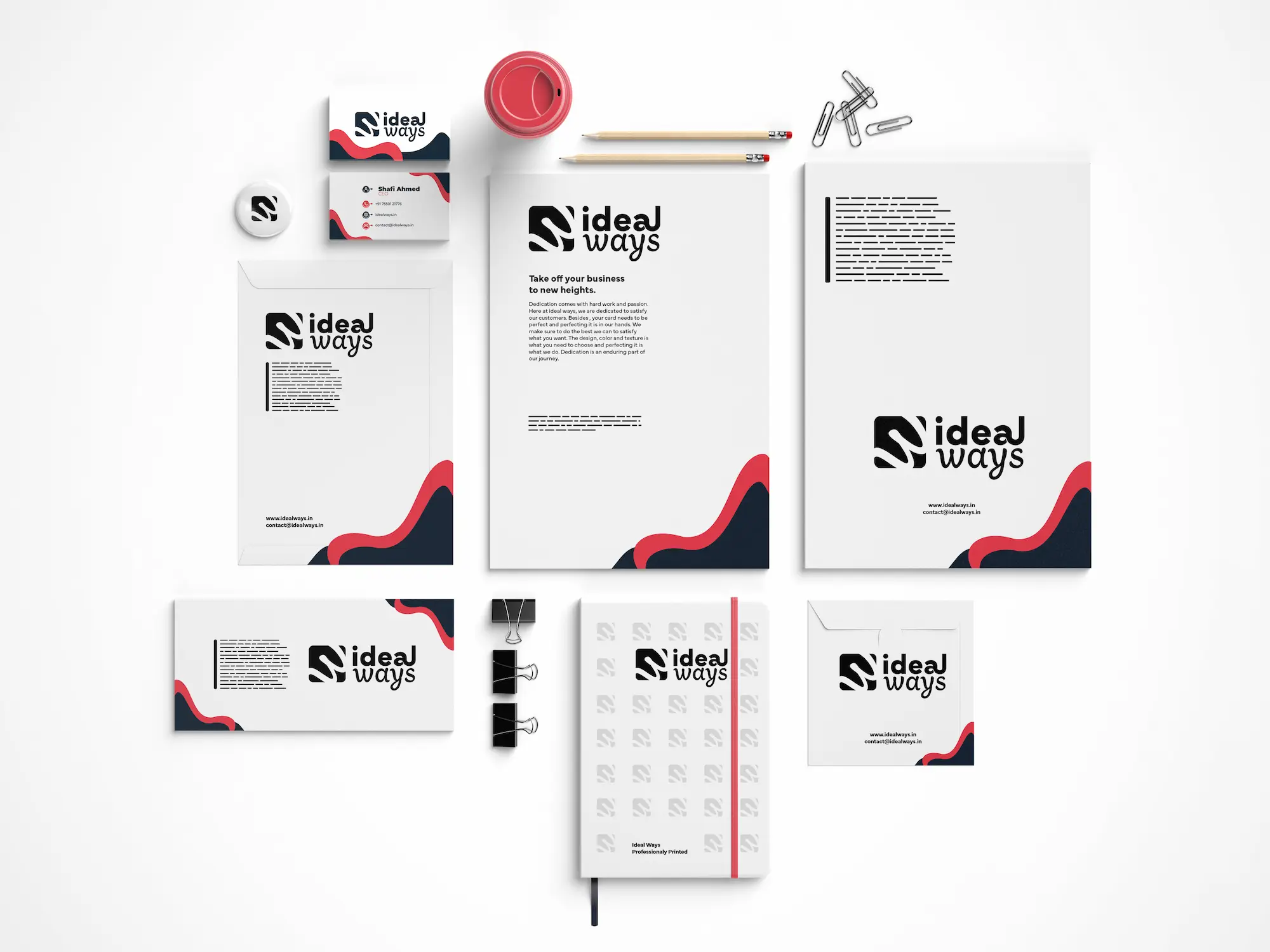
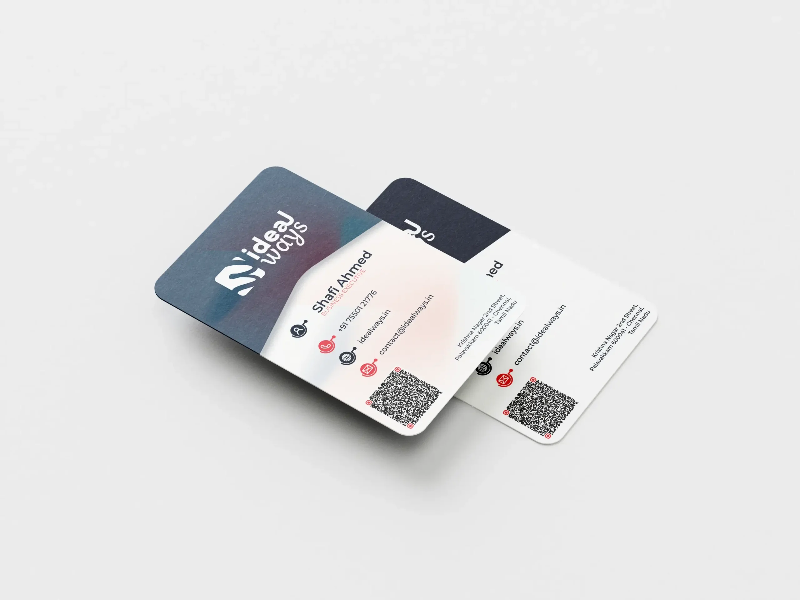
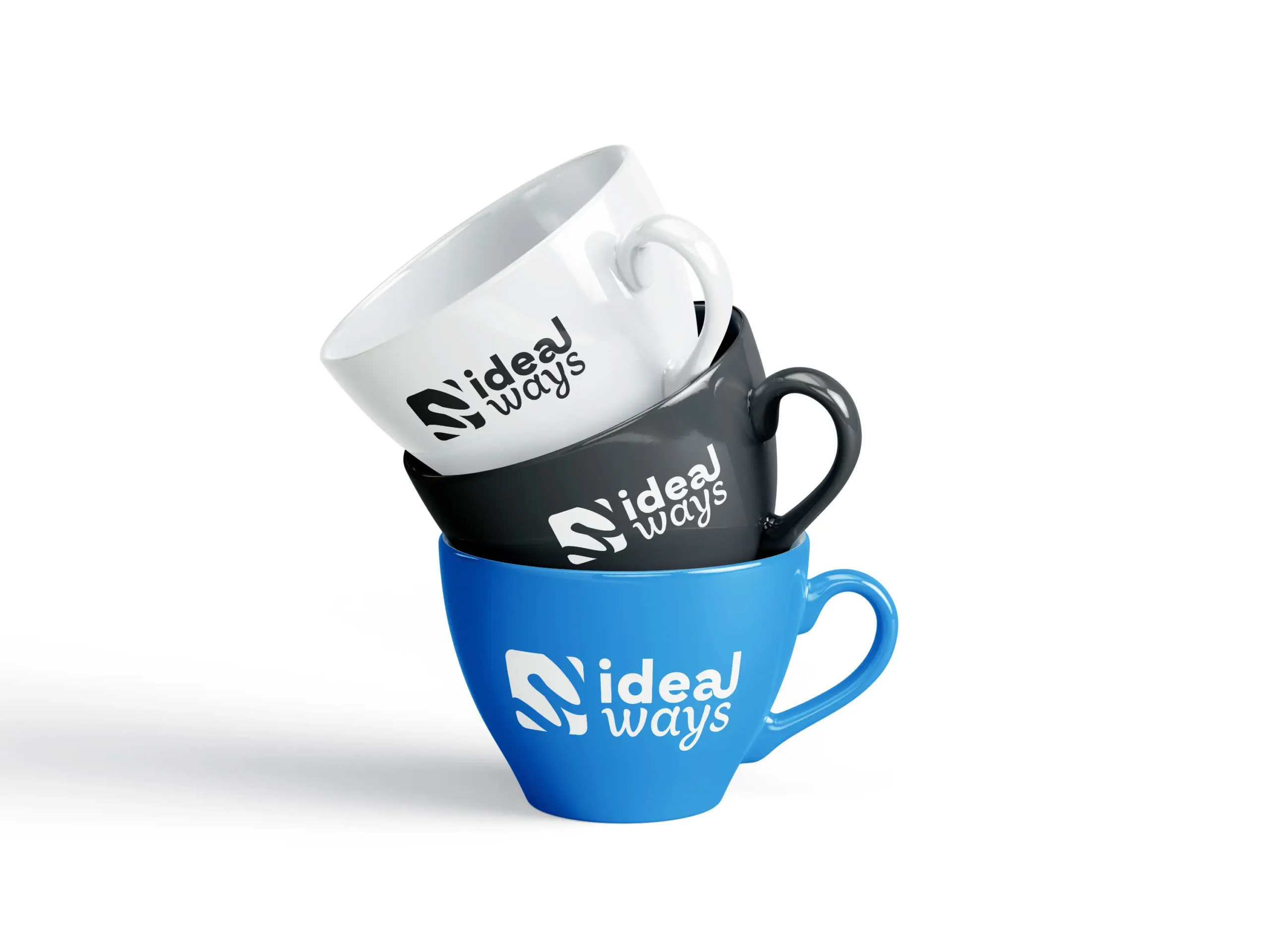
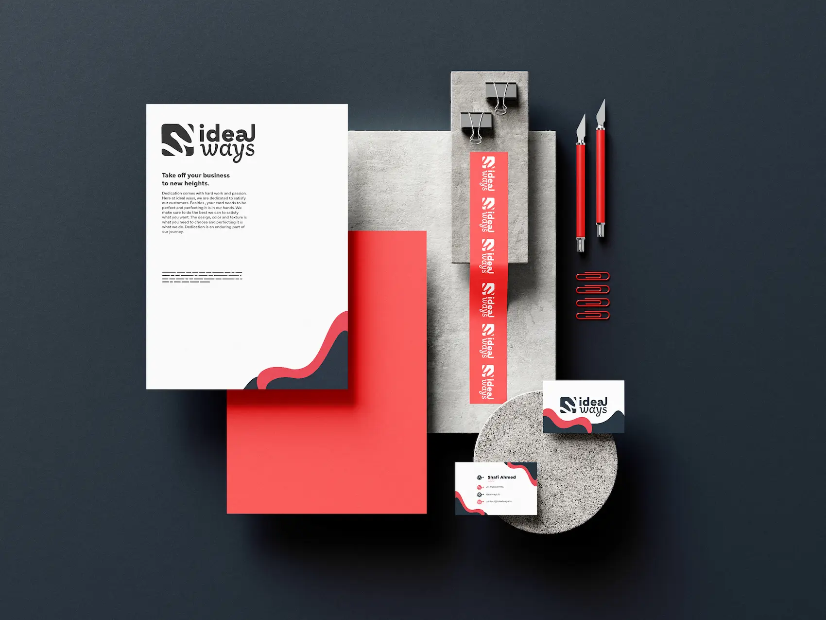
Brand Collateral
Designing forConversion
idealways.in